These Greenpeace adverts entitled ‘Not Only Is A Tree Cut Down’ aim to make people think about the negative consequences of deforestation and logging. They use the pictorial analogy template that Goldenberg, Mazrusky and Solomon (1999) outline, amongst others, in their paper The Fundamental Templates of Quality Ads.
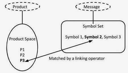
Pictorial analogy involves linking a product to a certain message by introducing a symbol into the product space. For example, this advert is linking deforestation (the product) to the message that is bad for the planet. The product space involves things that are related to the product (deforestation) and a symbol is something that is linked to the message that is being conveyed (deforestation is bad). The product space could involves things relating to deforestation such as a chainsaw, chopped trees or perhaps safety helmets whereas the symbol could involve degraded soil, homeless animals, dead animals, or dried rivers. A general schematic and deforestation specific schematic of this template is shown below.
 |
| General Schematic of Pictorial Analogy |
.jpg) |
| Anti-Deforestation Specific Schematic Pictorial Analogy |
References
Goldenberg, J., Mazursky, D. et al. (1999). The fundamental templates of quality ads. Marketing Science, 333-351.


wow! Extraordinary post. I like that post. Its always great to find good honest practical content. Thank you so much.
ReplyDelete