Friday, December 2, 2016
Feeling Blue? Good!
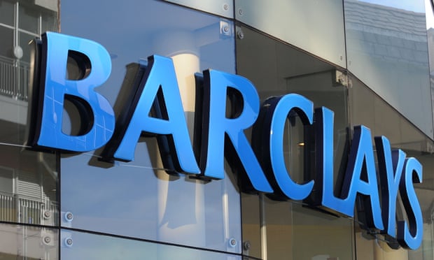
Colour perception is carried out through transforming light into signals in the brain via rods and cones, a process truly amazing... for another time. What's really important in the 'Persuasion and Influence' aspect of psychological research, is that colour makes people feel different emotions. You might have wondered walking through Coventry thinking, 'why are McDonalds red and yellow?' or 'why is Barclays blue?'. If this is not enough to get you thinking, imagine if someone turned up at a funeral dressed in orange. Surely this person would be surveyed with awe and contempt, if he has not been escorted out yet. Why is this though? Who sets these rules? It's simple. The reason for everything being coloured the way they are is because colour makes people feel different emotions.
Colour is a crucial factor in designing logos and advertisements, as colours convey emotional meaning. Evolution and culture have led mankind to perceive colours as different cues for different emotions, and colours are used in very clever ways in advertisements to persuade (and influence!) our minds.
The colour red represents danger, energy, and love. Primitive mankind knew that where there are signs of bloodshed, there is danger nearby. Which is why even now our brains perceive the colour red and feel danger, and feel alert. Feeling alert naturally carried over to feeling energetic, which is why brands such as Coca Cola, and Redbull use bright red logos.
Green is associated with freshness and nature, leading fresh food or drinks brands such as Tropicana, Starbucks and Subway to adopt green logos.
Blue is seen as tranquil, calm and trustworthy. This is why motor companies such as Ford and Volkswagen use blue logos. Blue logos are also widely used by corporations that deal with money or data-associated products in order to seem more reliable. Barclays, Bank of America, Samsung, Facebook, and Twitter all use blue logos.
Yellow is a cheerful and playful colour, which is why it is used by Chupa Chups, Denny's, and IMDb. DHL, Lamborghini and Chevrolet also use yellow or golden logos, as yellow also represents light, and speed.
Orange is similar to yellow in that it represents fun and energy, but unlike yellow, it is very difficult to find companies that wish to appear serious and sophisticated that use orange logos. Orange is seen as a more 'fun' colour than yellow, and is used by Nickelodeon, Fanta, Soundcloud and Blogger!
So where do these colour associations originate from? Research suggests that although some aspects may be due to evolution, most colour-emotion associations are learned. There are some colours that work as cues for different emotions between Western and Eastern cultures such as red, and there is evidence that people are likely to perceive colours differently depending on age and gender. However, as we see in the fact that we associate colour with certain emotions as passed down from our primitive ancestors, learning the association between colour and emotion is an ongoing process.


No comments:
Post a Comment
Note: Only a member of this blog may post a comment.